Branding
Design
Weaving trust into a crypto brand for 2.5 million first-time traders.

( 00-01 )
ABOUT THE PROJECT
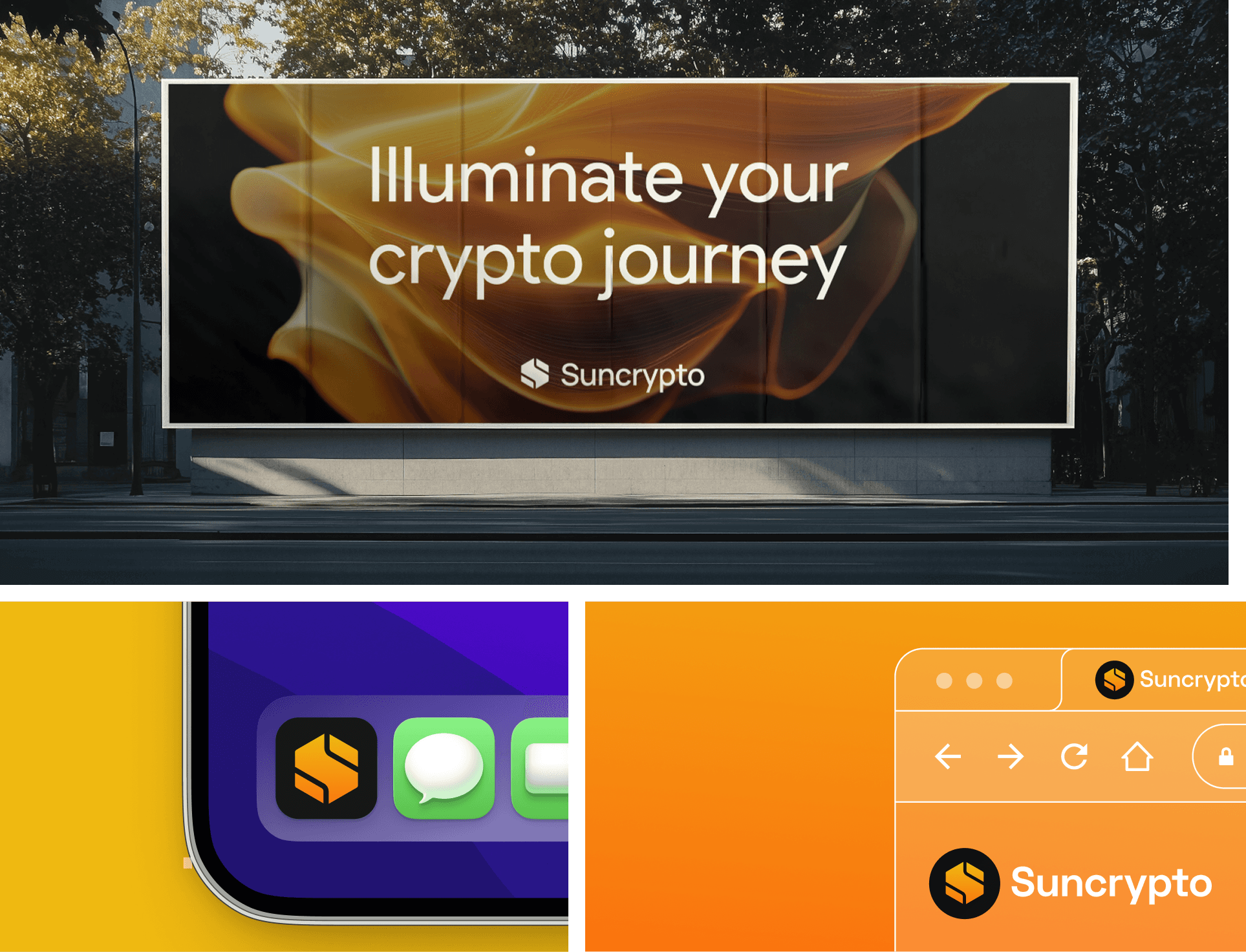
We led the rebrand and the UX/UI rebuild as a single engagement, because trust breaks at whichever layer is weakest. The work covered the identity system, the core trading flows, and the moments where new users decide whether to continue or leave. The platform now serves 2.5 million users at a 4.4-star rating, in a category where most apps struggle to hold either.
( 00-02 )
CHALLENGES
The brief carried two constraints that shaped everything after it, one for the interface and one for the mark.
Clarity without losing function. The interface had to stay fully capable for active traders while cutting the cognitive load that keeps everyone else out. Simplifying couldn't mean stripping things down. It meant showing the right amount, at the right moment.
A symbol that earns its meaning. The brand's promise is illumination, making a confusing industry legible. The mark had to carry that literally, not just gesture at it, and the color system had to read as clarity rather than crypto's usual palette of cold blues and neon.
( 00-03 )
THE PROCESS
Branding and product design ran as a single track, not a handoff between two teams.
BRANDING
This is where the brand promise had to become visible instead of implied.
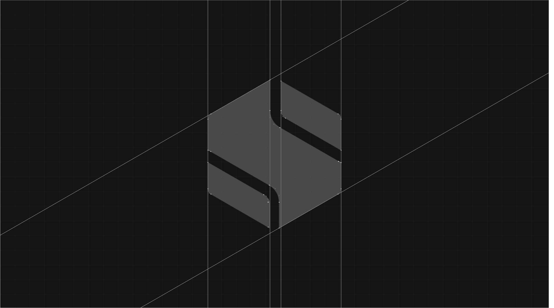
The identity is built on light cutting through complexity. The mark is a geometric “S” formed from folded planes, gold fading into deep amber, built to hold its shape at billboard size and app icon size alike.
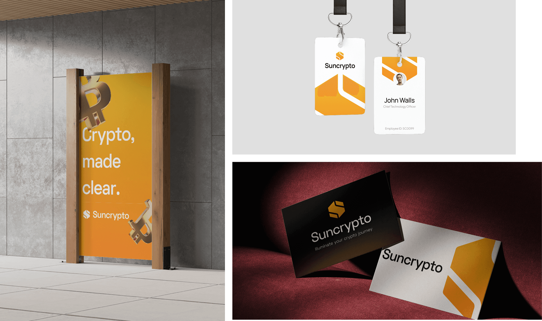
The palette does the same work as the mark. Warm gold and amber read as optimistic and premium, a deliberate break from crypto’s usual cold blue default, while staying dark mode native for the long sessions traders actually run.
USER INTERFACE
The moat here was the interface instead of the mark, but the brief stayed the same: remove friction without removing function.
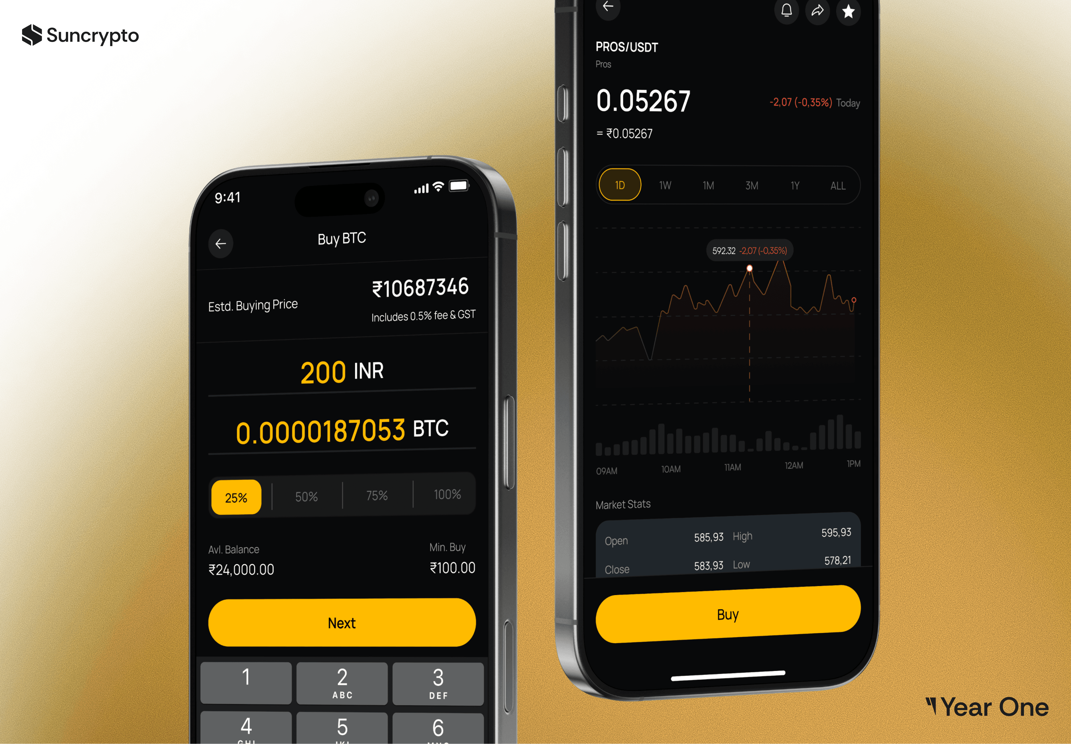
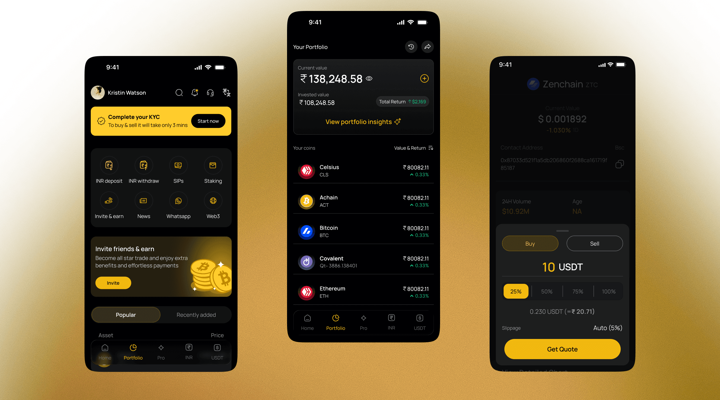
We rebuilt the core trading flows, buy, sell, chart, confirm, around progressive disclosure. New users see the essentials: amount, price, one clear action. Depth like order books, live charts, and market stats shows up the moment someone needs it, not by default for everyone.
Every surface, number, and button follows the same type scale and spacing logic as the brand system, so the app never feels like a different product from the billboard that brought someone to it.

OUTCOME
One system, measurable impact across brand and product.
2.5M+ monthly users · 4.4-star rating
3× MAU growth — from 300K to 900K after launch.
25s → 14s average transaction-flow time, improved by simplifying the experience.
( 00-03 )
DISCOVER MORE