
( 00-01 )
ABOUT THE PROJECT
How we gave Toronto's newest cinema brand a face — one that could hold its own on a theatre facade, a phone screen, and everything in between.
The Brief
A blank slate in a crowded market.
When Mosaic Cinemas came to us, they had a name, a location in Toronto, and a vision — but nothing else. No logo. No colour. No system. No precedent to follow or break from.
That's both the easiest and hardest kind of brief to receive. Easy, because there's no baggage to untangle. Hard, because every single decision carries full weight — there's no existing foundation to lean on.
Their goal was clear: build a cinema brand that speaks to young, culturally diverse movie-goers in one of Canada's most cosmopolitan cities. They didn't want to feel like a legacy multiplex chain. They didn't want to feel indie or scrappy either. They wanted to feel like the future of the theatre experience — premium, energetic, and genuinely modern.
We started, as we always do, not with sketches — but with a question. What does a cinema brand look like when it's built for the people who grew up on Instagram, not popcorn buckets?
"They didn't want the legacy multiplex feel. They wanted to feel like the future of the theatre experience."
Unpacking the Name
What does "Mosaic" actually mean?
Before any visual work began, we sat with the name. Mosaic is a loaded word — it evokes stained glass, tiles, fragments coming together into something whole. In Canada, it's also loaded with cultural meaning: the country famously describes its multicultural identity as a mosaic, not a melting pot.
This was useful. But it was also a trap. The obvious visual interpretation — literal tile patterns, bright fragmented colours — risks reading as craft fair rather than cinema. We tested that direction early, and quickly confirmed our instinct: a stained-glass logomark felt too artisanal, too static, too easily mistaken for a cultural centre or museum branding.
We needed to find the idea underneath the word. Mosaic isn't just about fragments. It's about many parts becoming one experience. That reframe changed everything — and pointed us toward cinema itself as the unifying metaphor. A movie ticket. One object that holds the promise of every story.
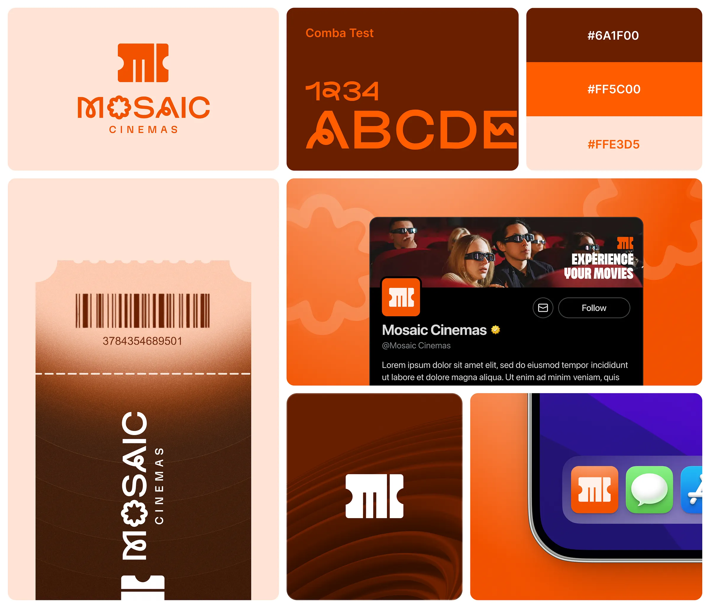
The Logomark
A ticket stub that thinks it's a letter.
The breakthrough came from a deceptively simple observation: a cinema ticket, cut in half, looks like the letter M — the first letter of Mosaic.
We explored the idea across two to three directions before arriving at the final mark. The first pass kept the ticket metaphor more literal — you could see the perforation, the stub edge. It was charming but too decorative for the brand's ambitions. The second direction stripped it back aggressively — two rectangular blocks with the ticket notches punched out — and it locked into place immediately.
What makes it work is the layering of meaning. To a casual viewer, it's a bold geometric mark — strong, modern, immediately ownable. Look a second longer, and the movie ticket reveals itself. Look once more, and the M emerges. Three readings in a single shape. That kind of density is rare in logo design, and it's usually the sign of a mark that will age well.
The letterforms in the full wordmark were custom-drawn to carry the same geometric weight as the symbol — compressed, authoritative, with just enough softness in the terminals to avoid feeling cold.
"Three readings in a single shape — a geometric mark, a movie ticket, and the letter M. That kind of density is usually the sign of a mark that ages well."
( 00-02 )
DELIVERABLES
With the strategic foundation in place, we moved into execution. Every deliverable was designed to work as part of a unified system — not a collection of isolated assets.
Colour Strategy
Orange is a decision, not a default.
Colour for a cinema brand is a loaded choice. Black is obvious — the darkness of a theatre, the void before the screen lights up. But black alone reads as luxury cinema, not a new-age entertainment venue for young Toronto. We needed a hero colour that had heat.
Orange was chosen as the primary for a specific reason: it doesn't exist anywhere in the established cinema landscape. The legacy chains own red and blue. The indie houses play with muted earth tones. Orange — particularly this saturated, slightly reddish-orange — sits unclaimed. It also carries exactly the right emotional register: energy, confidence, warmth, a slight irreverence.
The broader colour system was built for flexibility. Yellow-gold serves as a warm secondary — it has cinematic weight and photographs beautifully against black. The extended palette (electric blue, lime green) exists not as co-equal brand colours, but as background expression colours — surface treatments that let the logo breathe across different contexts without the identity feeling monotone.
Building the System
Identity is only real when it scales.
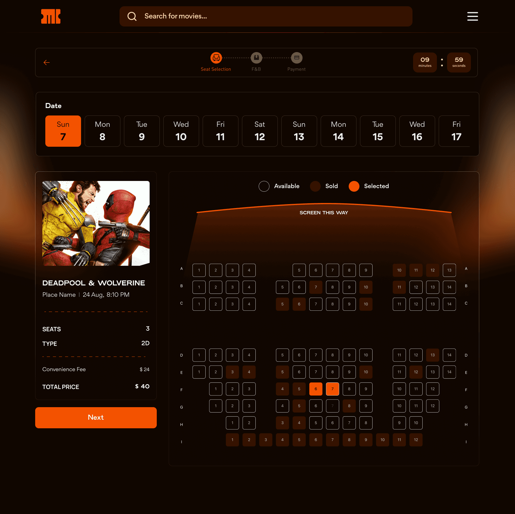
A logo is not a brand. A logo applied consistently across every touchpoint — that's a brand. Our job didn't end at the mark; it ended when we were confident the identity could survive the real world without someone holding its hand.
We stress-tested the system across the surfaces that matter most to Mosaic's audience: social media profiles, Stories, digital backgrounds, and the UI of their ticketing interface. Each surface demanded something slightly different from the identity — Instagram needed a circular profile crop that held legibility at 40px; Twitter/X needed a square that read as confident even within a feed of competing logos; Stories needed backgrounds that worked as full-bleed canvases without overwhelming the mark.
Rule 01 — The mark always breathes. Minimum clear space around the logomark equals the height of the ticket notch. No exceptions — not in Stories, not in small format.
Rule 02 — Orange earns its space. On coloured backgrounds, the mark flips to white or black. Orange as a background is reserved for the primary brand colour only — it never competes with the mark.
Rule 03 — Expression colours support, never lead. Blue, green and textured backgrounds exist to give the identity range. They are always backgrounds — never the primary surface of the mark itself.
( 00-03 )
SUMMARY
Every asset was built to be handed off and used — not explained. What Mosaic walked away with was a system confident enough to run itself.
Social & Digital Identity
Where the brand actually lives.
For Mosaic's audience, the brand's first impression will almost certainly be digital — a profile pic in a search result, a Story from someone they follow, a post in a feed. We designed with that hierarchy in mind.
The Instagram profile uses the mark on white within a circular crop — clean, legible, instantly distinct. The Twitter/X profile takes the mark on a dark square — same DNA, different context. The cover image on Twitter is the identity at its most expressive: the wordmark on a rich orange background with a subtle vertical stripe pattern, cinematic and bold.
Stories were designed to give the team a flexible system rather than a set of rigid templates. The four background directions — silver stripe on light, orange flat, dark with mark only, and editorial with photography — give enough variety to keep a feed interesting without ever drifting off-brand.
What We Delivered
From nothing to a complete identity system.
Mosaic Cinemas launched with a brand identity built to last — not a single logo, but a living system. The final deliverables covered the full scope of what a modern entertainment brand needs to operate: primary and secondary logo lockups, a full colour system with usage rules, the extended background expression library, social profile assets, Story templates, and UI consultation for their flagship digital ticketing experience.
The ticket-stub mark — with its triple-reading geometry — gives the brand a visual hook that is genuinely hard to forget. And the orange-led colour story ensures that wherever Mosaic shows up, it shows up loudly, without needing to explain itself.
That's the goal with any identity: that the brand can eventually walk into a room and be recognised before it speaks. We think Mosaic is there.
( 00-03 )
DISCOVER MORE